


There are a lot of scary charts and graphs out there.
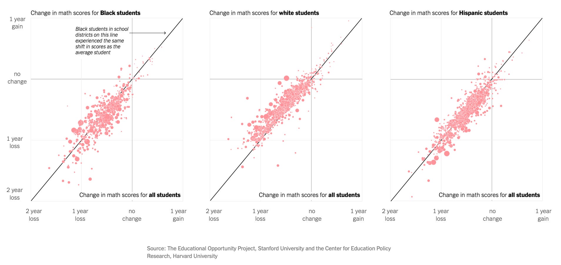
Like this one, which shows learning loss during covid lockdowns.
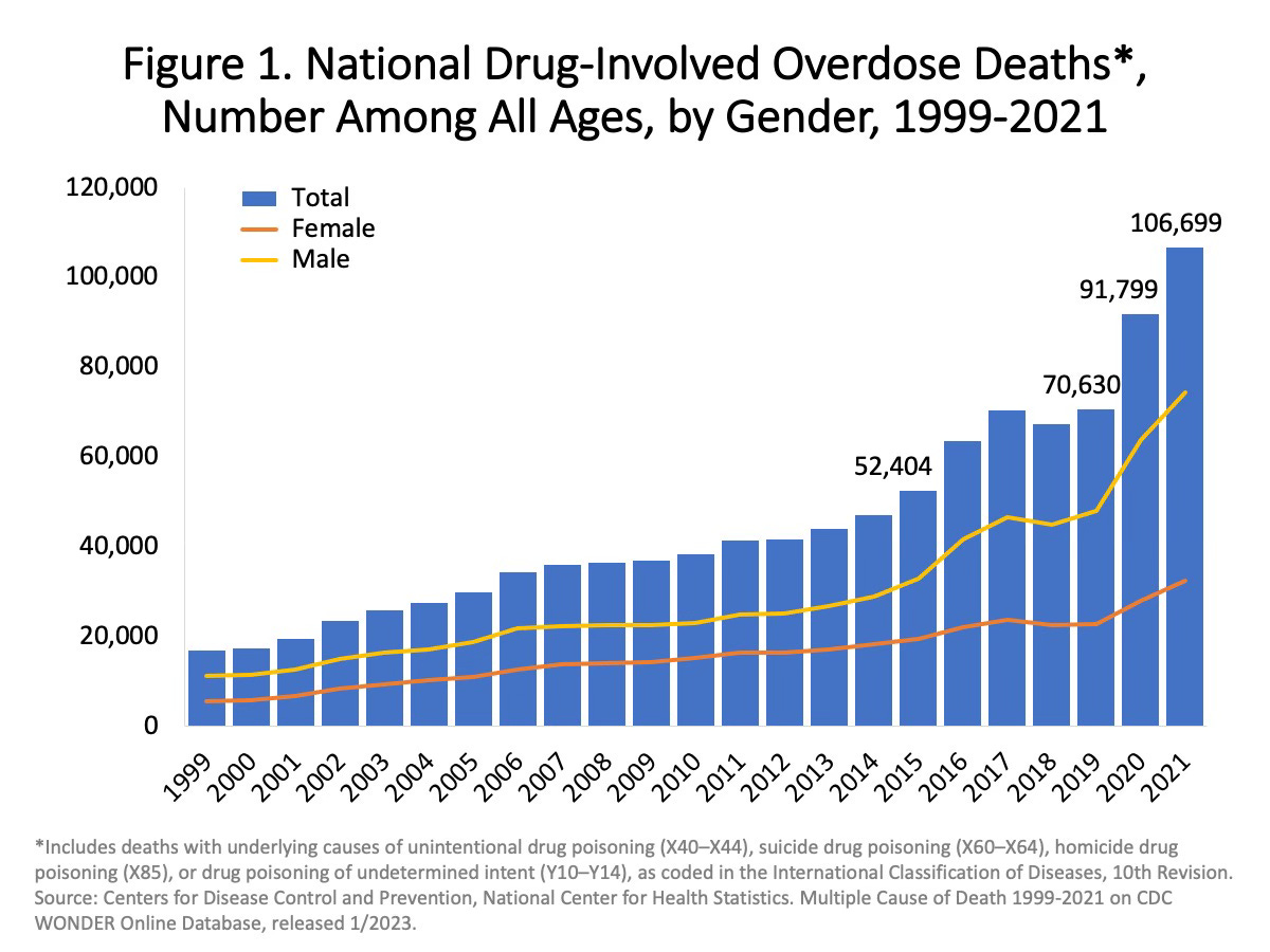
Or this one, which shows the increase in illicit drug deaths over the last twenty years.
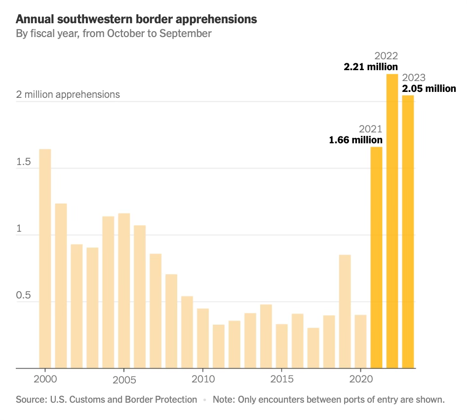
Or this one, which shows the spike in illegal border crossings.
But this chart is scarier than the others: